
Understanding Mirror’s Case
Background
Mirror is a clothing store that started back in 1994, a variety of clothing that appeals to budget-minded audiences but their clothing lines have different styles such as casual, business, sporty, party, and formal
There are over 400 stores around the world in 32 countries
Stores are not super fancy but are always well taken care of.
What is the issue?
Mirror is late to the digital transformation
They wanted to keep the service in person
but they can’t deny the e-commerce opportunity for huge potential growth
customers have been asking for an online platform for years.
Why Should Mirror Transition Online?
Customers have cited frustrations about not being able to find their sizes in-store, they are able to eliminate that frustration by having an online inventory shipped directly from their warehouse
A lot of remaining inventory and it is difficult to move when there are a few pieces left. Online shopping can eliminate that issue
Understanding Direct Competitors
When doing analysis of other competitors they all have many things in common rather than something different, the clothing e-commerce is a well-established institution. Companies like this all try to set fashion with cheap products that can appeal to the masses. This can lead to individuals not having a real brand loyalty to the company but only to search for clothes that are on fashion trends.
They all have similar functions in terms of just site navigation and the general check-out process, but what makes the difference between each company is how they understand the hierarchy of their products and how they present them.
Zara’s e-commerce is a fantastic website to look at, comparable to a fashion editorial magazine, but there is little to be desired when trying to navigate the site. As the site is very confusing
Empathizing with the Users
We have to understand the point of view of the targeted audience. Need to understand their needs and their frustrations
How do we accomplish this?
competitive analysis
user interview
self responding surveys
usability testing
Phase 1: Asking the Right Questions (Qualitative)
Do you prefer buying clothes online or in-person?
If online: ask them what they like about online
If in-person: ask them what they like about in-person shopping
How often do you shop online?
Can you recall your favorite e-commerce? Tell me about the experience you had.
Your favorite e-commerce store, could you pull it up and just walk me through how you went about shopping for your clothes?
Could you compare some of your experiences shopping online vs in person?
Were there any frustrations shopping online? Could you describe them to me?
Were there any frustrations shopping in person? Could you describe them to me?
What sort of devices do you use the most when you’re shopping?
Phone, tablet, desktop, or laptop?
Phase 1: Asking the Right Questions (Quantitative)
How would you generally rate the overall experience of shopping for clothes online?
On a scale of 10, 1 being the worst, 10 being the best
How would you generally rate the search and filter functions online?
On a scale of 10, 1 being the worst, 10 being the best
If rated less than 5, asked them what they could improve on
If rated more than 5, asked what they liked about it
How would you rate the return policies of online shopping?
On a scale of 10, 1 being the worst, 10 being the best
Understanding the Research
Participants used all sorts of devices, but the participants survey preferred using mobile devices such as phones and tablets
participants citing that there was a generally positive experience with online shopping
Participants expressed frustrations about items being misrepresented online.
Participants expressed the convenience of trying clothes in person as they were able to try on the clothes as well as seeing some of the item materials.


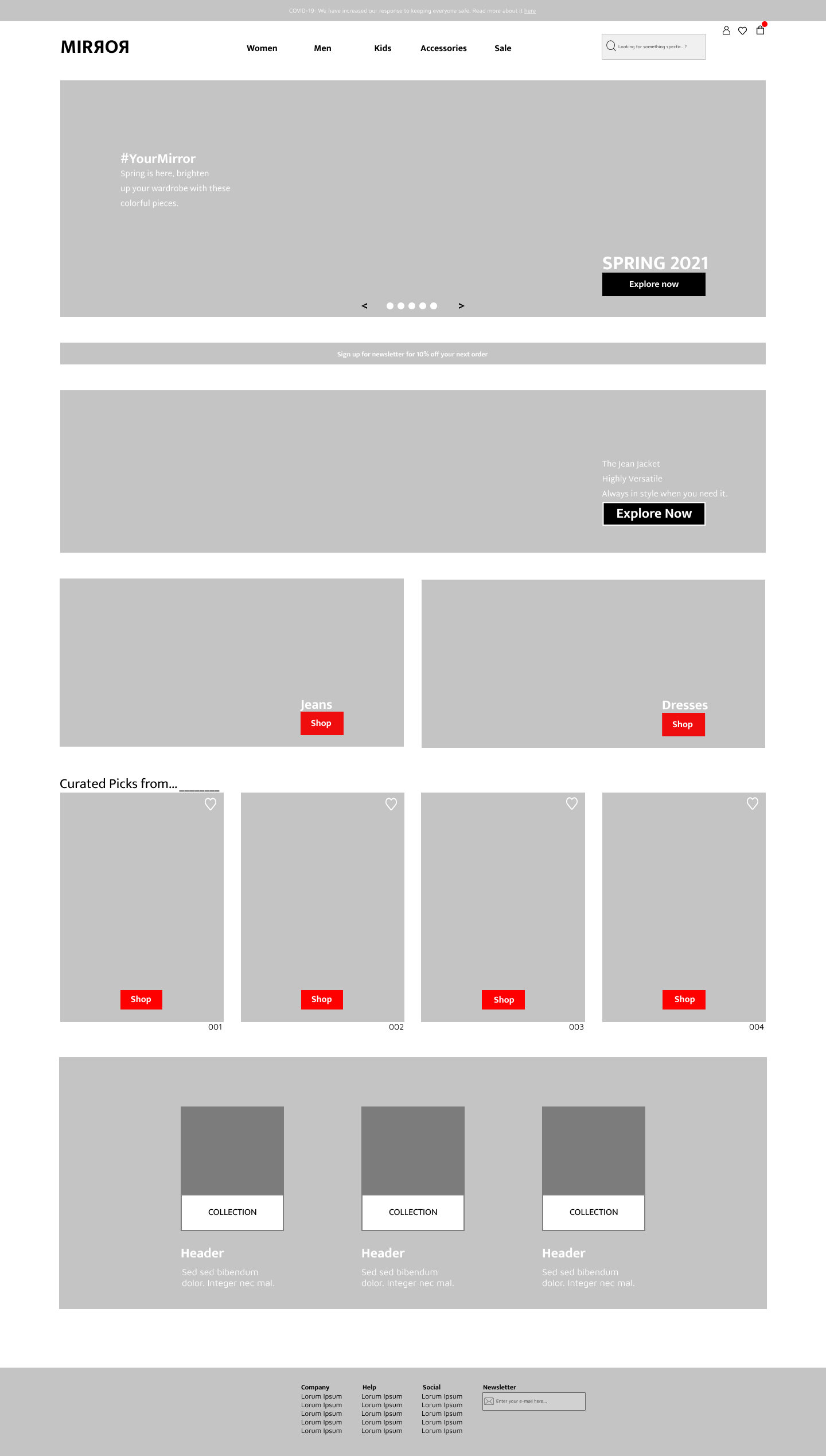
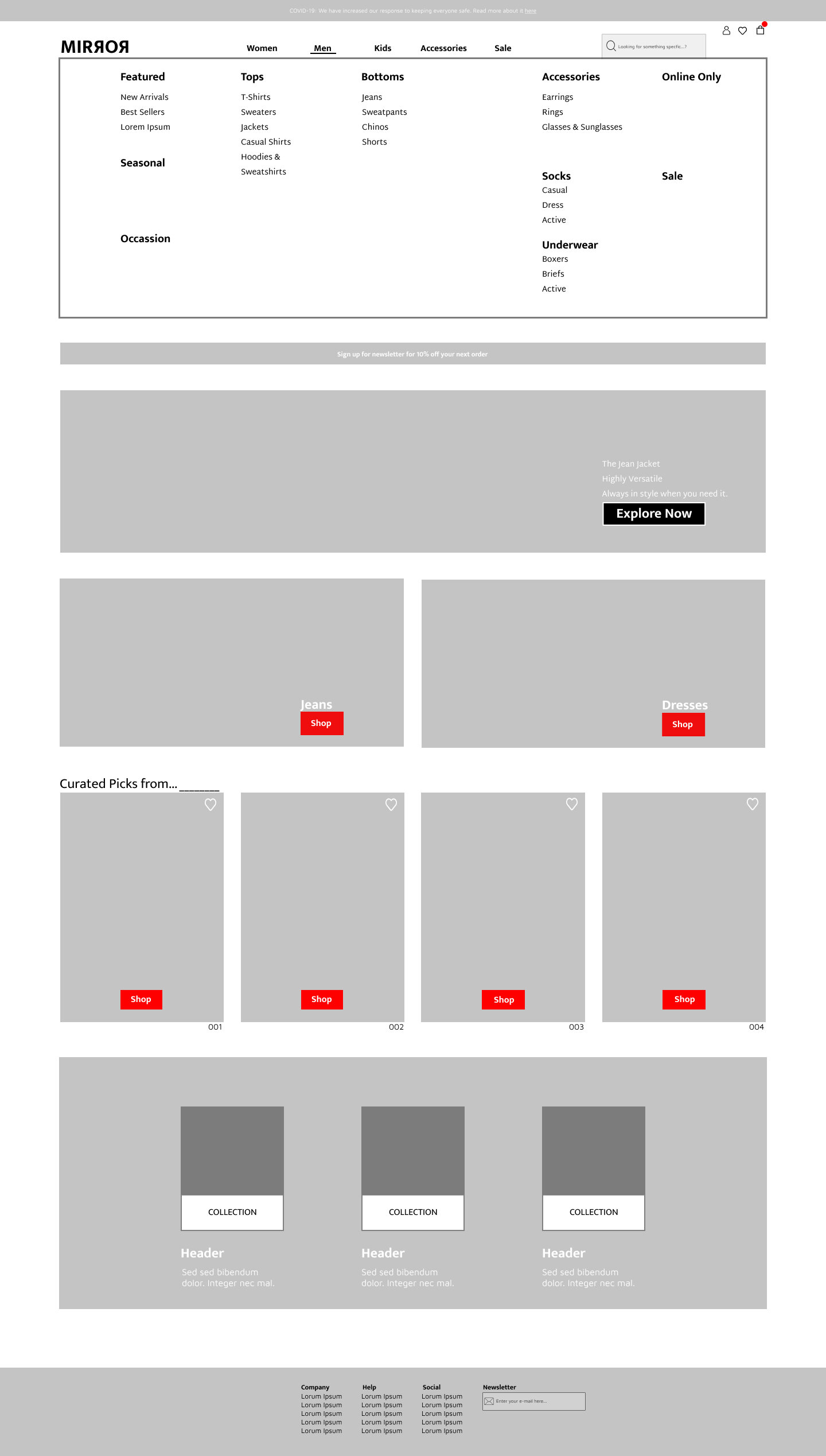

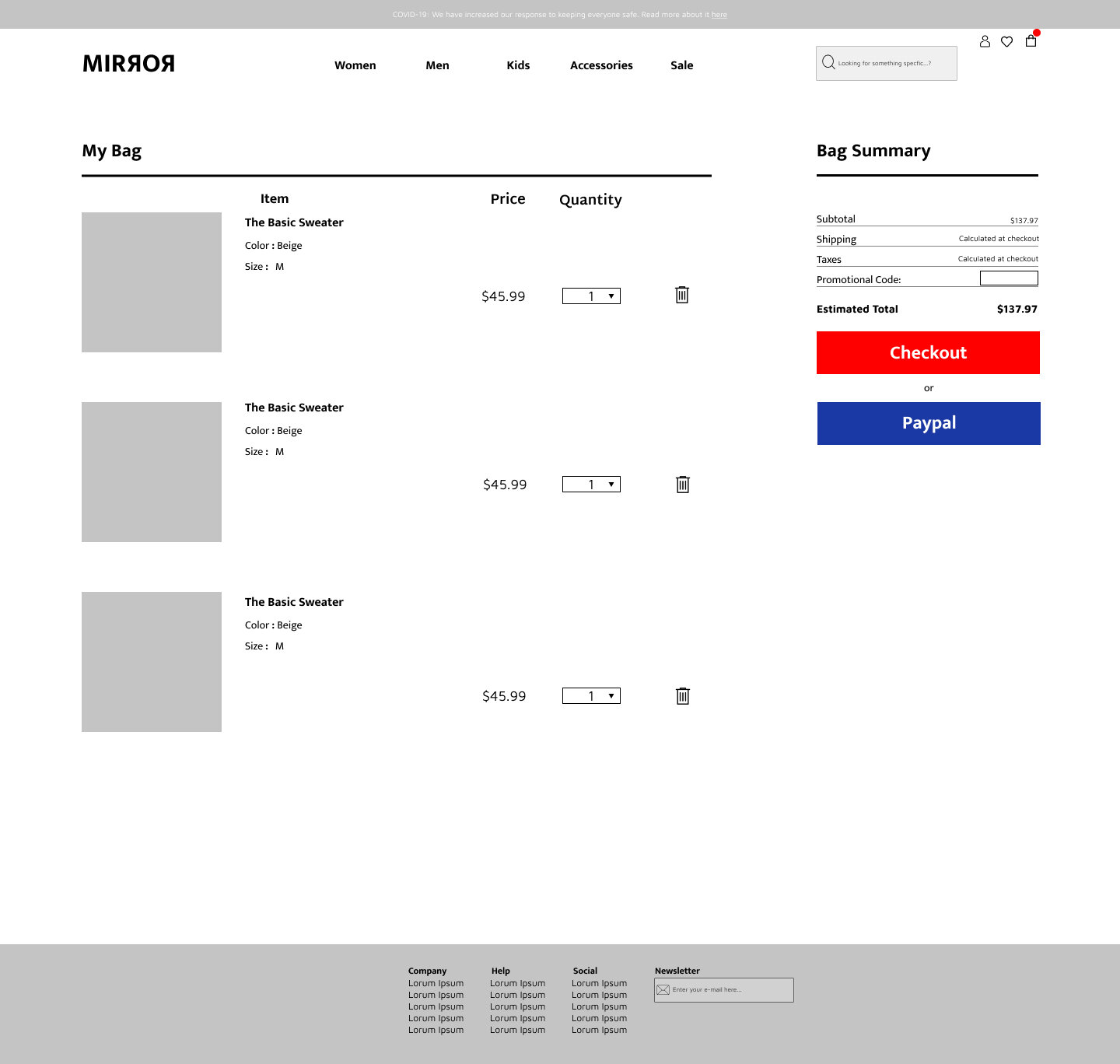
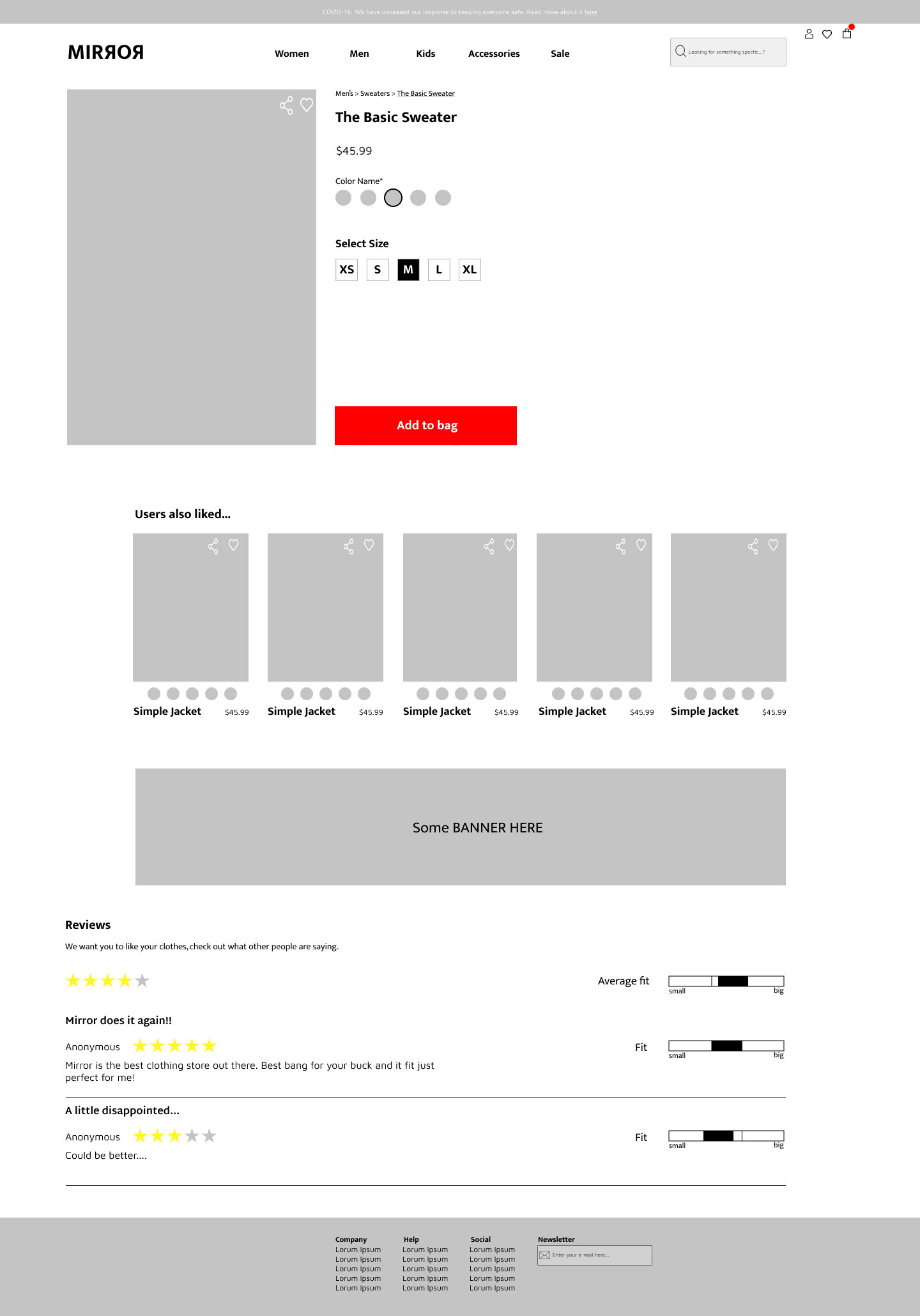
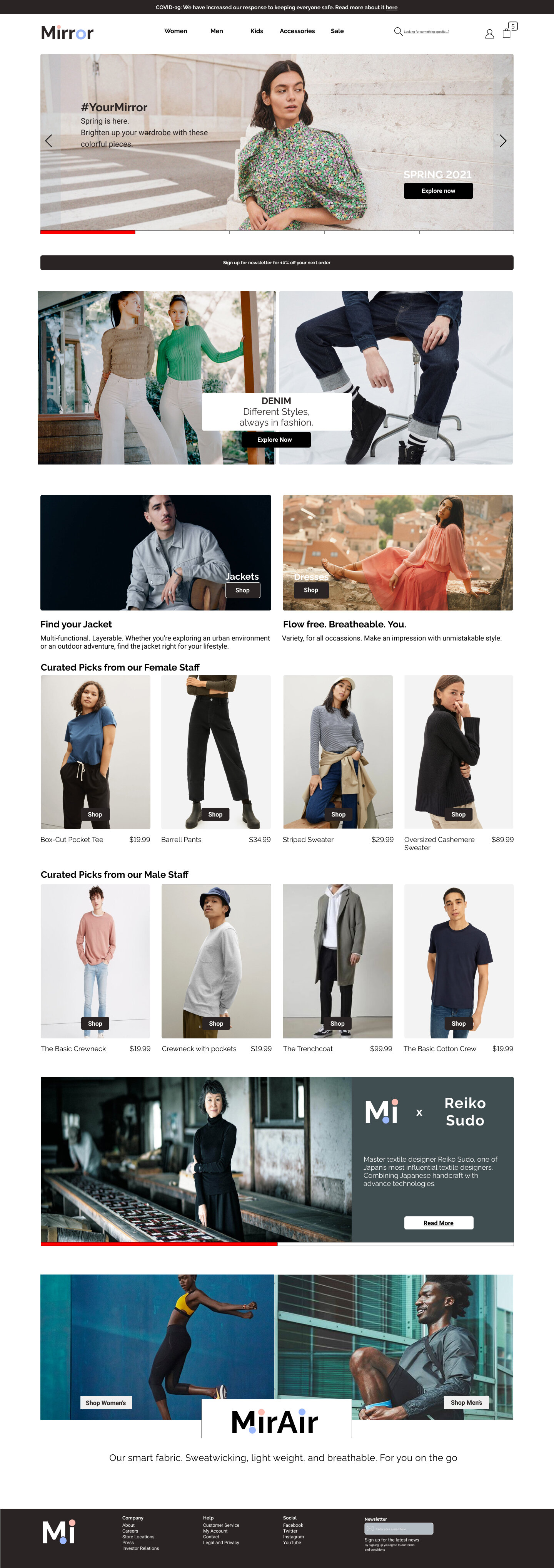
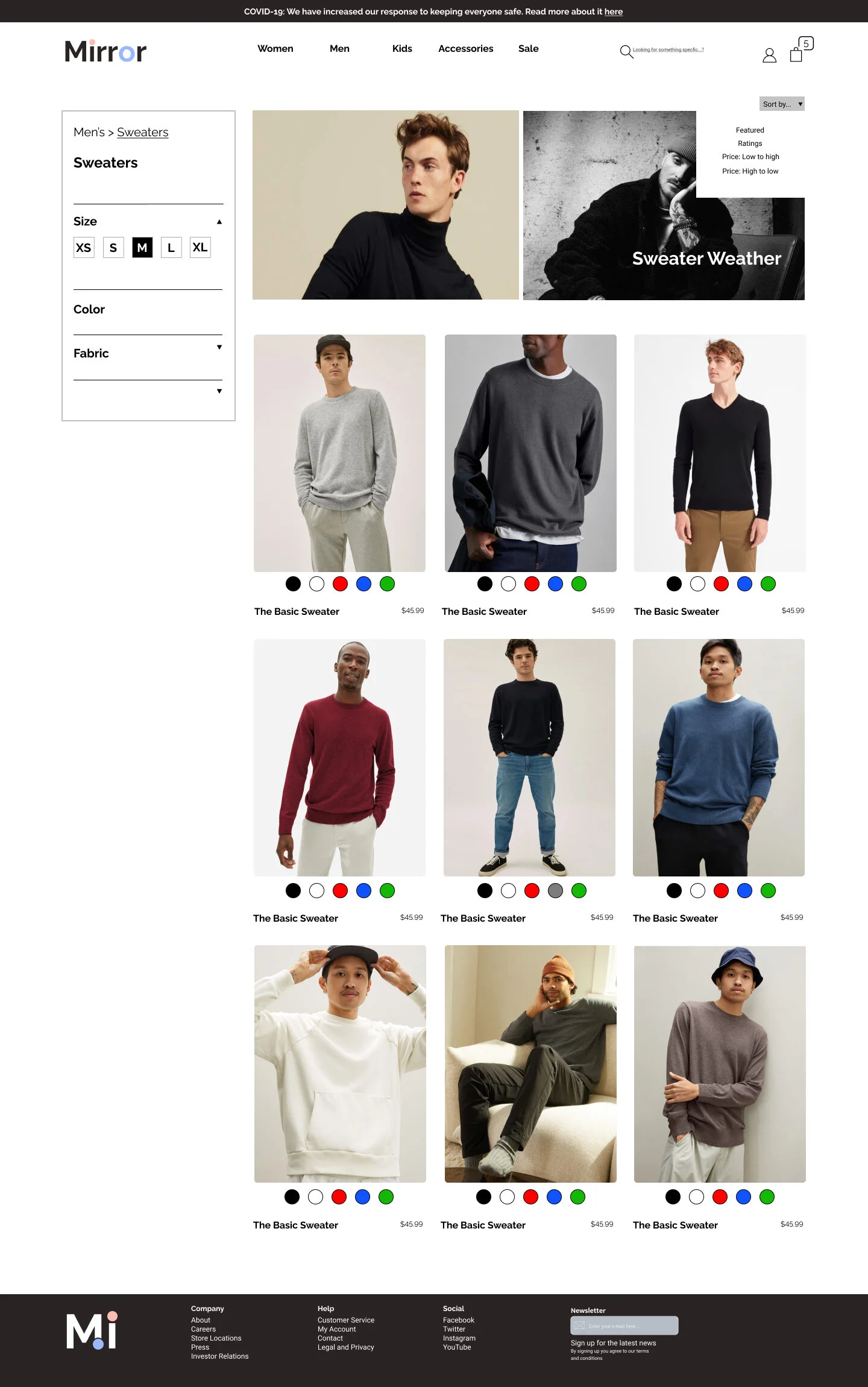

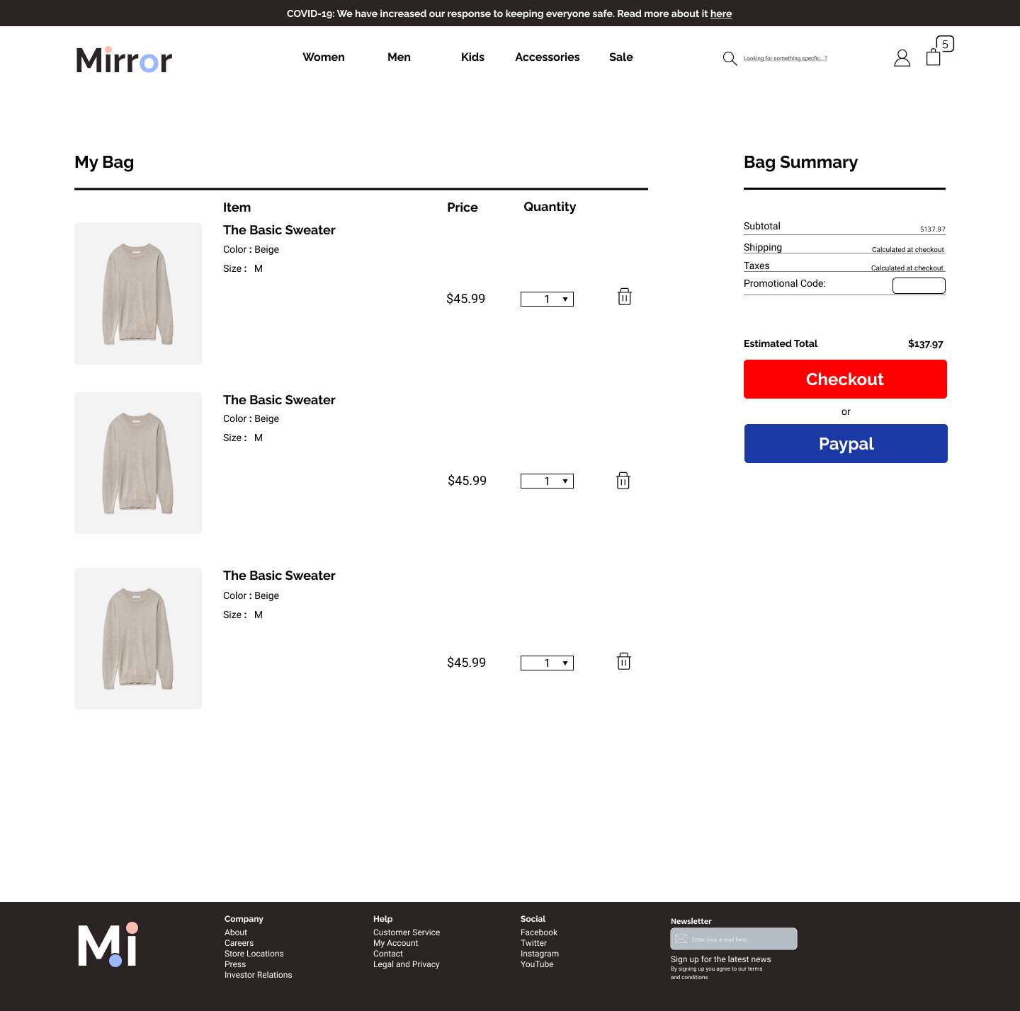

Prototyping Hi-Fi
Some issues came up during a usability test on my previous participants, one user addressed that some of the photos used on the website could’ve been misled to be mistaken as a more expensive website.
Affinity mapping from users on things to improve on the prototype
Success
Users have cited that the website is modern and fresh.
the navigation of the website was generally easy.
Collaborations were a good idea, it kept the clothing line refreshed and allowed it to attract more users.
Frustrations
Most frustrations that stemmed from this prototype is that not everything was interactive. Users were sometimes misled on their tasks
some of the color options are not reflective of the overall branding styles
Suggestions
Make clear some of the buttons that can be navigated.
examine the clear impact of having a wishlist or save for later options
Future Iterations - Test, test, test!
Design is an infinite loop, it is hard to create a well-polished product but we can get it there!
1.) Usability Testing
To continue creating a robust product, lets recruit more people from a larger sample size from different backgrounds and have them test the product to make sure everyone has a clear pathway of how to accomplish their goals
2.) Extra Features
Most frustrations from this prototype stemmed from unfinished products, and ending pathways. By implementing more pathways allowing users to have more autonomy allows them to complete their own tasks in their way instead of forcing them to complete them in one specific way.


